
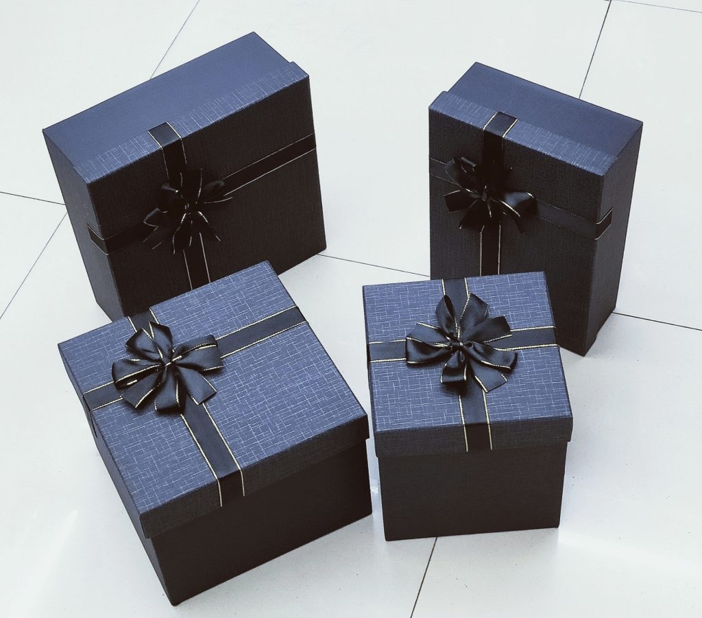
In modern packaging design, “Harmony but Difference” is more than an aesthetic philosophy. It is a strategic approach that balances brand consistency with product uniqueness, allowing companies to maintain visual identity while standing out in competitive retail environments.
For brands, retailers, and private label businesses, mastering this concept can significantly improve shelf impact, customer perception, and market differentiation.
What Does “Harmony but Difference” Mean in Packaging Design?
In creative packaging box design, “Harmony but Difference” refers to:
- Maintaining unified brand elements
- Creating variation between product lines
- Balancing structure and innovation
- Ensuring visual coherence while highlighting uniqueness
In commercial terms, it means:
✔ Brand recognition stays consistent
✔ Individual SKUs remain distinctive
✔ The packaging family looks premium
✔ Consumers easily identify product categories
This philosophy is widely used in cosmetic packaging, gift boxes, electronics packaging, luxury rigid boxes, and seasonal product lines.
Why This Concept Matters in Modern Branding
In today’s saturated retail market, packaging must achieve two goals:
- Immediate visual identity
- Memorable differentiation
If everything looks the same → brand becomes invisible.
If everything looks different → brand loses recognition.
“Harmony but Difference” solves this tension.
It ensures:
- Cohesive brand storytelling
- SKU segmentation clarity
- Better display coordination
- Higher perceived value
For OEM and private label brands, this approach significantly improves product line expansion efficiency.
Core Design Principles Behind “Harmony but Difference”
1️⃣ Unified Structural Framework
Maintaining structural harmony means:
- Same box type (rigid box, magnetic box, folding carton)
- Similar proportions
- Standardized opening experience
- Consistent dieline engineering
This ensures production efficiency and cost control while preserving visual identity.
2️⃣ Controlled Variation in Visual Elements
Designers introduce difference through:
- Color variations
- Pattern adaptation
- Surface finishing techniques
- Typography hierarchy
For example:
- Same logo placement
- Different Pantone colors per SKU
- Same embossing technique
- Different foil stamping tones
This creates product individuality without breaking brand structure.
3️⃣ Material Harmony with Textural Contrast
Premium packaging brands often use:
- Same base material (greyboard, art paper, kraft paper)
- Different surface textures (matte lamination, soft-touch, UV spot, embossing)
The tactile experience enhances perceived value while maintaining production consistency.
Applications Across Industries
Luxury Gift Packaging
Seasonal gift boxes use consistent structure but change:
- Color themes
- Graphic storytelling
- Surface decoration
This preserves brand DNA while refreshing market appeal.
Cosmetic & Skincare Packaging
Brands often maintain:
- Same structural layout
- Same logo size
- Same typography
But differentiate:
- Product color codes
- Ingredient imagery
- Finishing textures
This helps consumers quickly distinguish product functions.
Electronics Packaging
Maintaining minimalism and structural consistency while differentiating:
- Product model identifiers
- Highlight color accents
- Feature callouts
This improves retail shelf clarity.
Manufacturing Considerations for “Harmony but Difference”
From a production perspective, this philosophy requires:
✔ Accurate color management
✔ Stable printing calibration
✔ Surface finishing consistency
✔ Structured quality control
Professional packaging manufacturers ensure:
- Pantone color accuracy
- Die-cut precision
- Embossing depth uniformity
- Structural load-bearing testing
Without stable factory capability, visual harmony may fail in mass production.
Balancing Creativity and Cost Efficiency
A common mistake in creative packaging is over-customization.
True professional design balances:
- Visual creativity
- Production scalability
- Shipping optimization
- Material efficiency
By keeping structure unified, brands reduce:
- Mold costs
- Sampling costs
- Inventory complexity
This makes expansion into new SKUs more financially sustainable.
How Brands Can Apply This Strategy in Private Label Packaging
Step 1: Define core brand elements
Step 2: Standardize packaging structure
Step 3: Develop variation guidelines
Step 4: Create finishing technique hierarchy
Step 5: Test retail display coherence
When executed correctly, the packaging system becomes scalable and adaptable.
Why Professional Packaging Manufacturers Matter
To achieve “Harmony but Difference” in large-scale production, you need:
- Experienced structural engineers
- Skilled graphic production teams
- Advanced printing equipment
- Strict color quality management
Working with a factory that understands both design theory and production execution ensures your packaging maintains consistency across thousands of units.
FAQ
Q1: Is “Harmony but Difference” suitable for small brands?
Yes. Even small brands benefit from unified structure and scalable design systems.
Q2: Does this approach increase packaging cost?
Not necessarily. When structure is standardized, costs can actually decrease.
Q3: Can this strategy work for seasonal packaging?
Yes. It is especially effective for holiday or limited edition collections.
Q4: How do manufacturers ensure color consistency?
Through Pantone management systems and strict QC procedures.
Conclusion
“Harmony but Difference” is not simply a design philosophy — it is a commercial strategy that integrates branding, manufacturing efficiency, and market differentiation.
When applied correctly in creative packaging box design, it enhances brand identity, improves product line clarity, and strengthens long-term scalability.
For brands looking to expand product categories while maintaining strong identity, mastering this balance is essential.


No reply content