
China Guangzhou custom curtains OEM
China
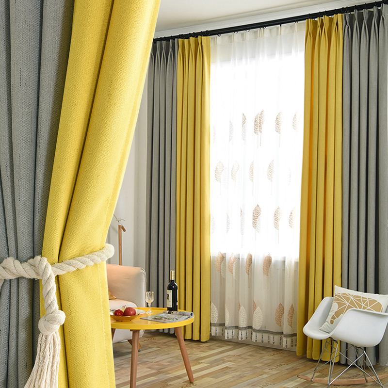
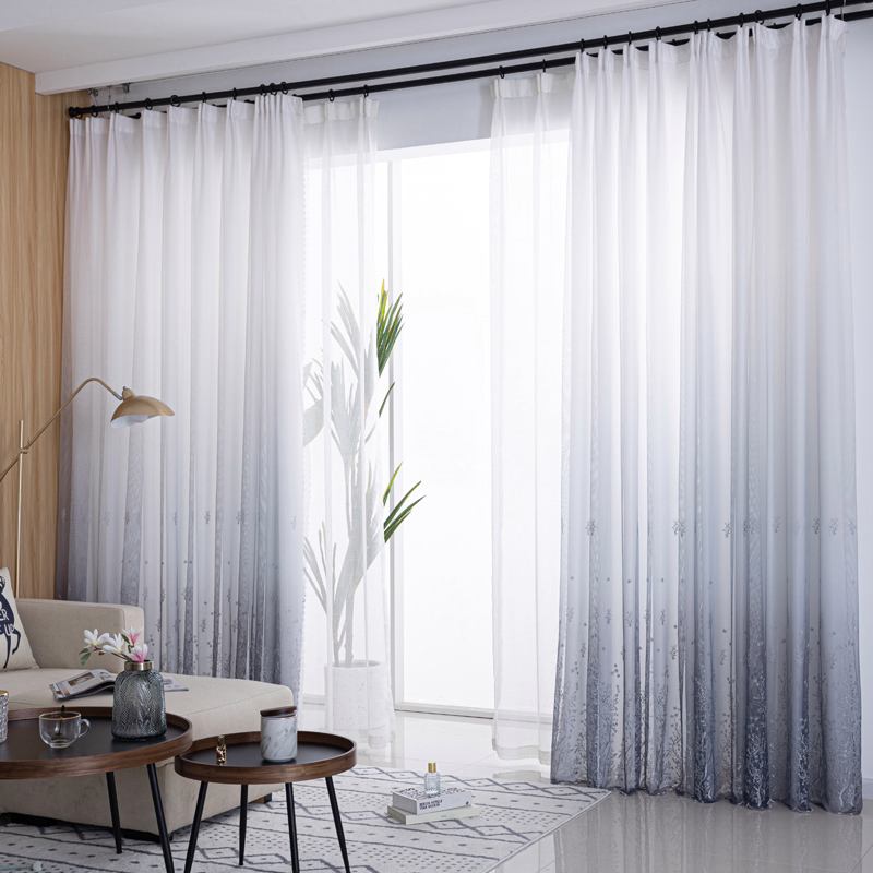
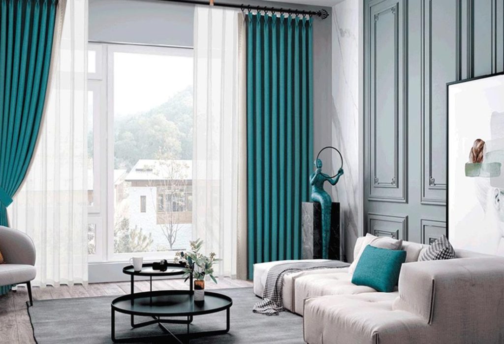
Curtains are more than just functional window coverings—they are the “visual frame” of a living room, shaping its atmosphere, enhancing its style, and tying together disparate design elements. Among the many decisions in interior design, curtain color matching stands out as both an art and a science: get it right, and the room feels cohesive and inviting; get it wrong, and it can disrupt the entire aesthetic. This article dives deep into the principles, psychology, and practical strategies of living room curtain color matching, offering actionable tips and real-world insights to help you create a space that reflects your personality and maximizes comfort.
I. The Importance of Curtain Color in Living Room Design
The living room is the heart of a home—a space for relaxation, socializing, and self-expression. Curtains, as a dominant soft furnishing, influence three key aspects of this space:
-
Atmosphere: Colors evoke emotions. Warm tones (reds, oranges) energize, cool tones (blues, greens) calm, and neutrals (beiges, grays) ground.
-
Style Definition: A bold-colored curtain can set a modern, eclectic tone, while a muted hue aligns with minimalist or traditional aesthetics.
-
Light Control: Lighter colors diffuse natural light gently; darker shades block glare or create intimacy.
Unlike fixed elements like walls or floors, curtains offer flexibility—they can be updated seasonally or as tastes evolve—making color matching a dynamic, creative process.
II. The Psychology of Color: How Hues Shape Perception
Before diving into matching techniques, understanding color psychology is essential. Each hue carries innate associations that affect how a space feels:
1. Warm Colors (Reds, Oranges, Yellows)
-
Red: Stimulates energy and passion. Use sparingly (e.g., as an accent) to avoid overwhelming the room.
-
Orange: Balances warmth and playfulness, ideal for social spaces.
-
Yellow: Evokes happiness and brightness, but can feel jarring in excess—opt for soft pastels (e.g., butter yellow) in large doses.
Effect: Make rooms feel cozier, smaller (in a good way), and more intimate.
2. Cool Colors (Blues, Greens, Purples)
-
Blue: Calms the mind, perfect for creating a serene retreat. Light blues (sky blue) feel airy; navy adds sophistication.
-
Green: Connects to nature, promoting relaxation. Sage green is trendy for its earthy, versatile vibe.
-
Purple: Luxurious and creative. Lavender or lilac adds softness without being overpowering.
Effect: Make rooms feel larger, more open, and tranquil.
3. Neutral Colors (Whites, Grays, Beiges, Browns)
-
White: Purity and simplicity. Off-white (ivory, cream) adds warmth; stark white can feel clinical.
-
Gray: Modern and versatile. Charcoal gray adds drama; light gray keeps things airy.
-
Beige/Tan: Earthy and timeless, pairs well with almost any color.
-
Brown: Grounding and cozy, especially in leather or wood tones.
Effect: Act as a “blank canvas,” allowing other elements (furniture, art) to shine.
4. Bold/Accent Colors (Mustard, Teal, Burgundy)
These hues add personality. Use them in small doses (e.g., as a pop of color in patterned curtains) to avoid clashing.
III. Core Principles of Curtain Color Matching
Matching curtain colors is not about random selection—it follows structured principles rooted in color theory and design harmony. Here are the most effective strategies:
1. Monochromatic Matching: Tonal Unity
Using variations of a single color (e.g., light blue, sky blue, navy) creates a cohesive, sophisticated look. This works because all hues share the same undertone, eliminating visual conflict.
How to apply:
-
Pick a base color (e.g., green) and select curtains 2–3 shades lighter or darker (sage green, olive green, emerald green).
-
Pair with matching throw pillows or a rug to tie the room together.
-
Pro tip: Add a metallic accent (gold/silver rods) to prevent monochromatic schemes from feeling flat.
2. Complementary Matching: High Contrast Drama
Complementary colors sit opposite each other on the color wheel (e.g., red-green, blue-orange, yellow-purple). When paired, they create vibrant contrast that makes both colors “pop.”
How to apply:
-
Use one color as the dominant shade (e.g., blue walls) and the other as an accent (orange curtains).
-
Balance intensity: If the wall is a bright blue, opt for a softer orange (peach) to avoid clashing.
-
Example: A gray sofa with mustard-yellow curtains (yellow-gray are complementary) adds warmth without overwhelming.
3. Analogous Matching: Harmonious Flow
Analogous colors are adjacent on the color wheel (e.g., blue-green, green-yellow, red-orange). This scheme feels natural and calming, as the hues share a common undertone.
How to apply:
-
Choose 2–3 neighboring colors (e.g., teal, seafoam green, mint).
-
Let one color dominate (teal walls) and the others support (seafoam curtains, mint throw).
-
Pro tip: Add a neutral (white/beige) to break up the flow if the scheme feels too “matchy-matchy.”
4. Triadic Matching: Balanced Vibrancy
Triadic schemes use three colors equally spaced on the color wheel (e.g., red-yellow-blue, purple-green-orange). This creates a lively yet balanced look, ideal for eclectic or playful spaces.
How to apply:
-
Assign one color as the main (e.g., red walls), one as secondary (yellow curtains), and one as an accent (blue pillows).
-
Keep one color dominant to avoid chaos—e.g., 60% red, 30% yellow, 10% blue.
5. Neutral Base with Accent Colors: Timeless Flexibility
Start with a neutral curtain (white, gray, beige) and add pops of color through accessories (rugs, art, cushions). This is the safest and most versatile approach, as neutrals act as a backdrop for evolving tastes.
How to apply:
-
White curtains with a gray pattern pair with any furniture color.
-
Add a bold-colored valance (top portion of the curtain) for subtle flair.
IV. Harmonizing Curtains with Room Elements
A living room is a system of interconnected parts—walls, furniture, flooring, and decor. Curtain colors must align with these elements to avoid discord.
1. Matching with Wall Colors
-
Light Walls (White, Beige): Darker curtains (navy, charcoal) add depth; lighter curtains (pastel blue) keep it airy.
-
Dark Walls (Navy, Forest Green): Light curtains (cream, light gray) prevent the room from feeling cave-like.
-
Bold Walls (Red, Teal): Neutral curtains (off-white, tan) let the wall be the star.
Rule of thumb: The curtain color should be 1–2 shades lighter or darker than the wall.
2. Coordinating with Furniture
-
Leather Sofas: Brown/black sofas pair well with earthy tones (olive, terracotta) or cool grays.
-
Fabric Sofas: Match curtain colors to a secondary fabric color (e.g., a floral sofa’s green leaves inspire sage green curtains).
-
Wood Furniture: Warm wood (oak) pairs with earthy neutrals; cool wood (ash) works with blues/greens.
3. Aligning with Flooring
-
Hardwood (Light Oak): Cream, light gray, or soft blue curtains.
-
Hardwood (Dark Walnut): Beige, taupe, or pale green curtains.
-
Carpet (Neutral): Any curtain color works; for bold carpets, stick to neutrals.
4. Complementing Decor (Art, Rugs, Pillows)
Pull a color from a prominent decor item (e.g., a red rug, a blue painting) and use it in the curtains. This creates a “color thread” that unifies the room.
V. Considering Light Conditions: Natural vs. Artificial
Light dramatically affects how curtain colors appear. A color that looks vibrant in a showroom may seem dull or overwhelming in your living room.
1. Natural Light
-
North-Facing Rooms (cool, indirect light): Use warm colors (yellow, peach) to add coziness.
-
South-Facing Rooms (bright, direct light): Opt for cool colors (light blue, gray) to balance heat.
-
East/West-Facing Rooms (harsh morning/afternoon sun): Sheer or semi-sheer curtains (linen, cotton) diffuse light without blocking views.
2. Artificial Light
-
Warm Light (2700K–3000K, yellow-tinted bulbs): Enhances warm curtain colors (orange, red) and mutes cool tones.
-
Cool Light (4000K+, white/blue-tinted bulbs): Makes cool colors (blue, green) pop and washes out warm hues.
Tip: Test curtain swatches in your living room at different times of day to see how light interacts with the color.
VI. Functional Needs: Balancing Aesthetics and Utility
Curtains serve practical purposes beyond decoration. Color choices should align with these needs:
1. Light Control
-
Sheer Curtains (white, light gray): Allow 70–80% light transmission—ideal for daytime privacy.
-
Semi-Sheer (linen, unbleached cotton): Block 40–60% light—good for diffusing harsh sun.
-
Blackout Curtains (dark blue, charcoal, black): Block 90–100% light—perfect for home theaters or shift workers.
2. Privacy
-
Street-Facing Windows: Darker colors (navy, brown) obscure views better than light ones.
-
Suburban/Rural Settings: Lighter colors (cream, pale green) maintain openness while adding privacy.
3. Durability and Maintenance
-
High-Traffic Rooms: Choose stain-resistant fabrics (polyester blends) in darker colors (hides dirt better).
-
Allergy-Prone Homes: Opt for hypoallergenic materials (cotton, linen) in light colors (easier to spot dust).
VII. Style-Specific Color Matching
Different interior styles have distinct color palettes. Aligning curtain colors with your style ensures cohesion:
1. Modern/Minimalist
-
Colors: Neutrals (white, gray, black) with one bold accent (mustard, teal).
-
Patterns: Solid colors or subtle textures (herringbone, twill).
2. Scandinavian/Nordic
-
Colors: Whites, light grays, soft pastels (pale blue, mint).
-
Inspiration: Nature—think “misty forest” or “snowy landscape.”
3. Bohemian/Eclectic
-
Colors: Jewel tones (emerald, sapphire, ruby) or earthy brights (terracotta, ochre).
-
Patterns: Mix and match—florals, stripes, and geometric prints.
4. Traditional/Classic
-
Colors: Rich neutrals (burgundy, navy, hunter green) with gold/cream accents.
-
Fabrics: Velvet, silk, or brocade for a luxurious feel.
5. Industrial
-
Colors: Charcoal, slate gray, or black.
-
Textures: Burlap, canvas, or faux leather for a raw, edgy look.
VIII. Practical Tips for Different Living Room Sizes
Room size impacts how colors are perceived. Here’s how to adapt:
1. Small Living Rooms
-
Goal: Create the illusion of space.
-
Colors: Light neutrals (white, cream, light gray) or soft pastels (pale blue, mint).
-
Avoid: Dark, bold colors (make the room feel cramped).
-
Trick: Vertical stripes (real or printed) draw the eye upward, adding height.
2. Large Living Rooms
-
Goal: Add warmth and intimacy.
-
Colors: Deeper neutrals (taupe, charcoal) or warm tones (terracotta, golden yellow).
-
Trick: Layered curtains (sheer + opaque) add dimension without overwhelming.
IX. Case Studies: Real-World Color Matching Examples
To illustrate these principles, here are three hypothetical living room scenarios:
Case 1: Modern Minimalist Living Room
-
Walls: White
-
Furniture: Gray fabric sofa, oak coffee table
-
Decor: Black metal floor lamp, abstract art (white/black/gray)
-
Curtain Choice: Light gray linen curtains (monochromatic with walls) + black rod (accent).
-
Result: Clean, airy, and sophisticated.
Case 2: Bohemian Eclectic Living Room
-
Walls: Terracotta
-
Furniture: Multicolored patchwork sofa, rattan armchairs
-
Decor: Macramé wall hangings, potted plants
-
Curtain Choice: Mustard-yellow cotton curtains (complementary to terracotta) with tassel trim.
-
Result: Vibrant, cozy, and full of personality.
Case 3: Traditional Family Living Room
-
Walls: Navy blue
-
Furniture: Brown leather sofa, mahogany bookshelves
-
Decor: Gold-framed family photos, Persian rug (red/blue)
-
Curtain Choice: Cream silk curtains (neutral base) with a thin gold stripe (accent).
-
Result: Elegant, warm, and family-friendly.
X. Conclusion: The Art of Curtain Color Matching
Matching living room curtain colors is a journey of balancing theory, personal taste, and practical needs. By understanding color psychology, applying harmonious schemes, and aligning with room elements, you can transform a simple window treatment into a design statement. Remember: there are no “rules” only guidelines—trust your instincts, experiment with swatches, and create a space that feels uniquely yours.
FAQ: Your Curtain Color Matching Questions Answered
Q1: How do I choose a dominant color for my curtains if my living room has multiple colors?
A: Identify the “anchor” color—often the largest furniture piece (sofa) or a bold decor item (rug/art). Use this as your guide: pick a curtain color 1–2 shades lighter/darker, or a complementary hue. If overwhelmed, default to a neutral (gray/beige) as a base.
Q2: Are dark-colored curtains too depressing for a living room?
A: Not if balanced! Pair dark curtains (navy, charcoal) with light walls, warm lighting (yellow-tinted bulbs), and bright accents (throw pillows, art). They add coziness and sophistication, especially in large rooms.
Q3: What’s the best curtain color for a small living room?
A: Light neutrals (white, cream, light gray) or soft pastels (pale blue, mint). These reflect light, making the room feel larger. Avoid dark, bold colors, which can shrink the space visually.
Q4: How do I match curtains with a brightly colored sofa?
A: Use a neutral curtain (off-white, tan) to let the sofa stand out, or pick a complementary color (e.g., blue sofa → orange curtains) in a softer shade (peach). Avoid matching the sofa exactly—this can feel flat.
Q5: My living room gets little natural light. What curtain color should I choose?
A: Opt for light, warm colors (butter yellow, soft peach) to reflect artificial light and add warmth. Avoid dark colors, which absorb light and make the room feel dim.
Q6: Can I mix patterns in curtain color matching?
A: Yes, but limit to 2–3 patterns. For example, a striped curtain in blue/white can pair with a floral pillow in the same blue. Keep the color palette consistent to avoid chaos.
Q7: Should curtain colors change with the seasons?
A: It’s optional but fun! Swap light, airy curtains (linen, pastels) in summer for warmer tones (velvet, deep reds) in winter. Store off-season curtains to keep them in good condition.
Q8: What’s the difference between “warm” and “cool” grays?
A: Warm grays have undertones of beige/brown (e.g., “greige”); cool grays lean blue/purple. Match warm grays to earthy decor, cool grays to modern/blue-toned spaces.
Q9: How do I know if a curtain color will “date” quickly?
A: Stick to timeless neutrals (white, gray, beige) or classic combinations (blue/white, green/tan). Avoid overly trendy hues (e.g., neon pink) unless you plan to update frequently.
Q10: Can I use the same curtain color in multiple rooms?
A: Yes! A consistent color (e.g., light gray) across rooms creates flow in an open-plan home. Vary textures (linen in the living room, velvet in the bedroom) to add interest.
Final Tip: Always order fabric swatches before buying. Live with them in your living room for a few days—you’ll quickly see how the color interacts with light, furniture, and mood. Happy decorating!


No reply content